When creating a wire or mockup in Figma, you may want to add comments on design and specifications, and I thought this comment widget would be easy to use, so I included it as a reminder.
Figma default comment function is difficult to use.
When creating a wire or mockup in Figma, you may want to add comments on the design and specifications, but Figma’s default comment function is a balloon pop-up display, which is not a good list.
This is a mockup of the application for “Mia,” a talking cat-like robot that speaks dialect.

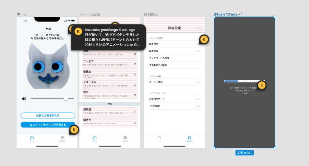
Here is a screen shot of a past mockup of the merpeople, but the problem is that when multiple people are collaborating, the comments section becomes chaotic.
Also, although someone will comment back on a past comment, it is quite difficult to keep track of the status of whether or not the issue pointed out in that comment has been addressed after all.
In my case, I tried to delete all the comments (even those of others) by clicking the “Done” button when the comment has been responded to, but the psychological hurdle of deleting other people’s comments was a bit high. However, the psychological hurdle of deleting other people’s comments was a bit high, so I was not able to do the PDCA cycle properly.
This makes it difficult to tell at a quick glance to what extent the design fix is being done.
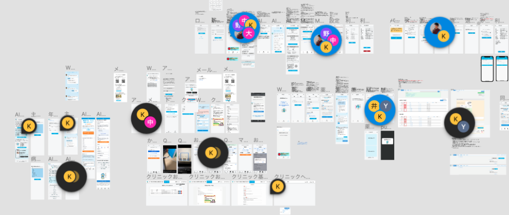
Sticky notes for comments, but the next thing you know, the screen is chaos.
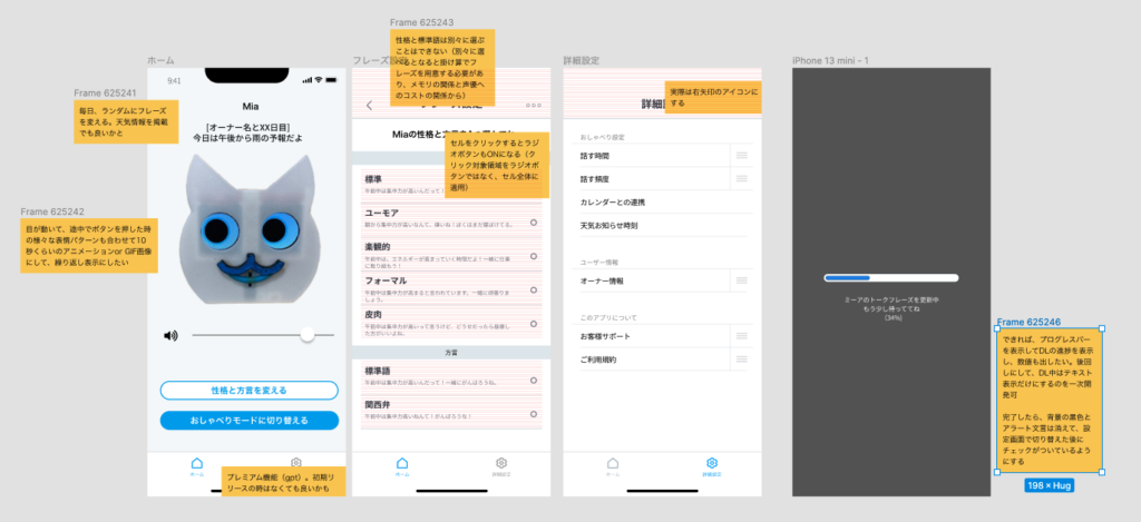
In order to ensure a list of comments, I made and pasted my own sticky notes for comments in Frame, as shown below, from the middle of the process.
This made the listing better, but there was no pointer for annotations, so it was like covering the screen with a Frame of comments, and the next thing you know, the listing of the screen was lost and chaos ensued.
In this regard, I liked the Figma default small balloon comment display feature.
Know the Comment Notes
While I was feeling the issue with the comment section, but without researching plug-ins, I noticed that the Figma screen of one of the projects I am participating in has a clean design that maintains the list of comments without cluttering up the screen, even though multiple members are commenting. I noticed that the design of the comments was beautiful.
When I told the designer that this comment was beautiful, he said, “Figma has a widget called Comment Note, which is useful for managing time stamps and status.
How to use the comment note
In the Figma toolbar, click on the Component, widget, and plugins icon, then the Widgets tab, then the Comment note.
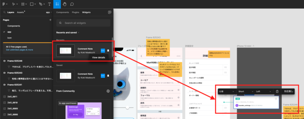
Figma’s comment notes are, from left to right.
- Specifications: for status management. You can select a comment type from five choices (specification, operator memo, correction, review, and confirmation required). The color of the border changes by default when the status is changed.
- Short: Length of annotation pointer; select from short and long
- Left: Selection of point position (Left, Right, Top, Bottom, None)
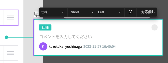

Resolved: Display a check mark for comments that have been addressed and resolved by turning on/off the “Resolved” icon in the menu.
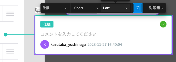
No response: The entire comment note is grayed out and enters the no response state.

Also, by default, the name of the submitter and a timestamp will be added below the comment.
It specializes in status management, and the functions are simple and great.
Personally, I found it wonderful that the choice of points was narrowed down to SHORT and LONG and that there were only two choices.
Figma has a default button for screen transition flow, which is highly functional and can flexibly connect screens with lines, including curves, as shown below. This is a good idea, but if the pointers are made so flexible in the comments section, comments can be placed anywhere, and if they are pulled in from the outside using curves, the pointers may be covered by other comments, and it may become chaotic.
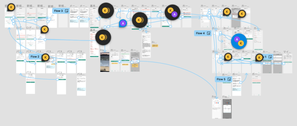
Therefore, I suspect that the pointer is limited to a straight line and short/long, and the position where comments can be written is narrowed down against the screen to maintain consistency and readability.
So, as a test, I modified Mia’s earlier comment on the mock screen with a comment note.
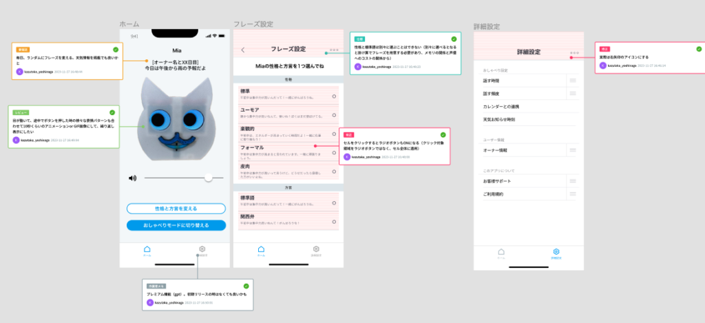
The pointer makes the screen clearer because there is no need to cover the comments on the screen (although it takes up more space in the comment section)!
After creating one screen, write comments and then create the next screen.
If you have already created a mock screen as shown below, and the screens are not too far apart from each other, if you try to insert a comment note later, it will be covered over the adjacent mock screen and you will have to manually move the adjacent screen.
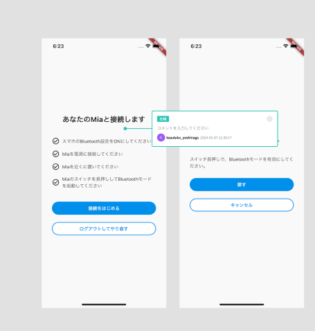
To prevent this, after creating one screen, it is better to create the next screen with a comment note for that screen. If the screen structure to be created next is similar, the frame will be copied and pasted, but the screen will be copied next to it, avoiding the comment note.
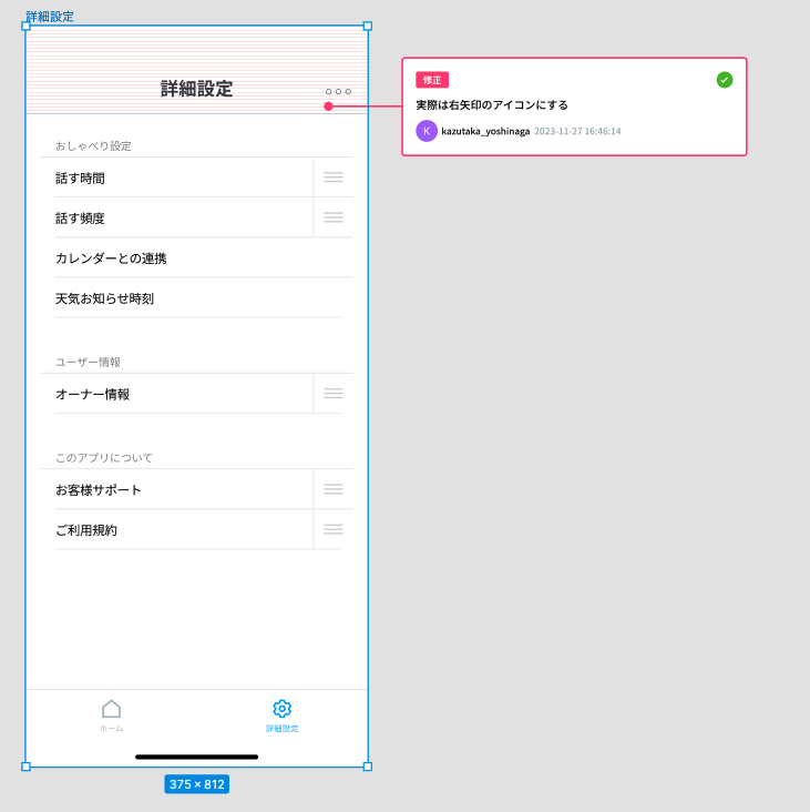
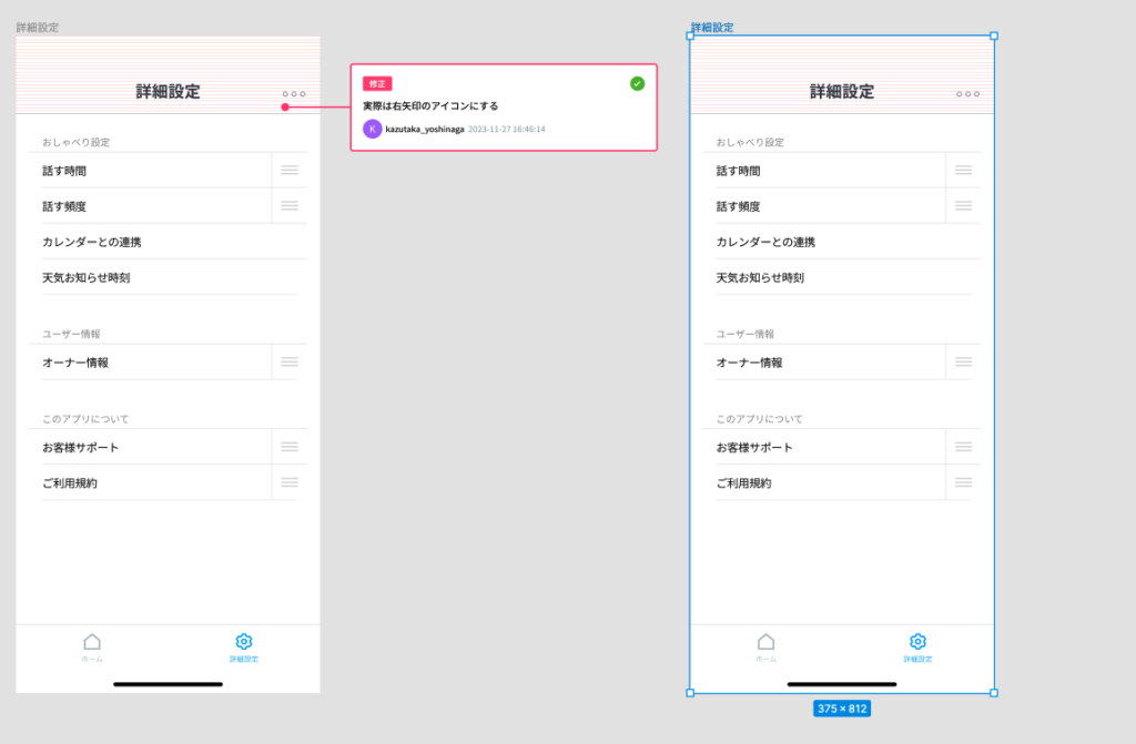
It is also an appropriate time to leave comments, since it is easy to keep in mind the comments that should be written for the screen immediately after creating one screen, and it is easy to add reviews and comments from other designers after you have created your own mockups because it automatically takes up the width of the comment notes. It is also easy to add comments when other designers add their reviews and comments after I have created a mockup.
It saves the hassle of having comment notes cover the screen and having to move them to full screen later.
So, the comment note on the figma plugin, that was useful.
It will be fun to write comments. I’m sure there are other good comment plugins out there if you look for them, but I think I’ll try this one for once.
コメント