Introduction.
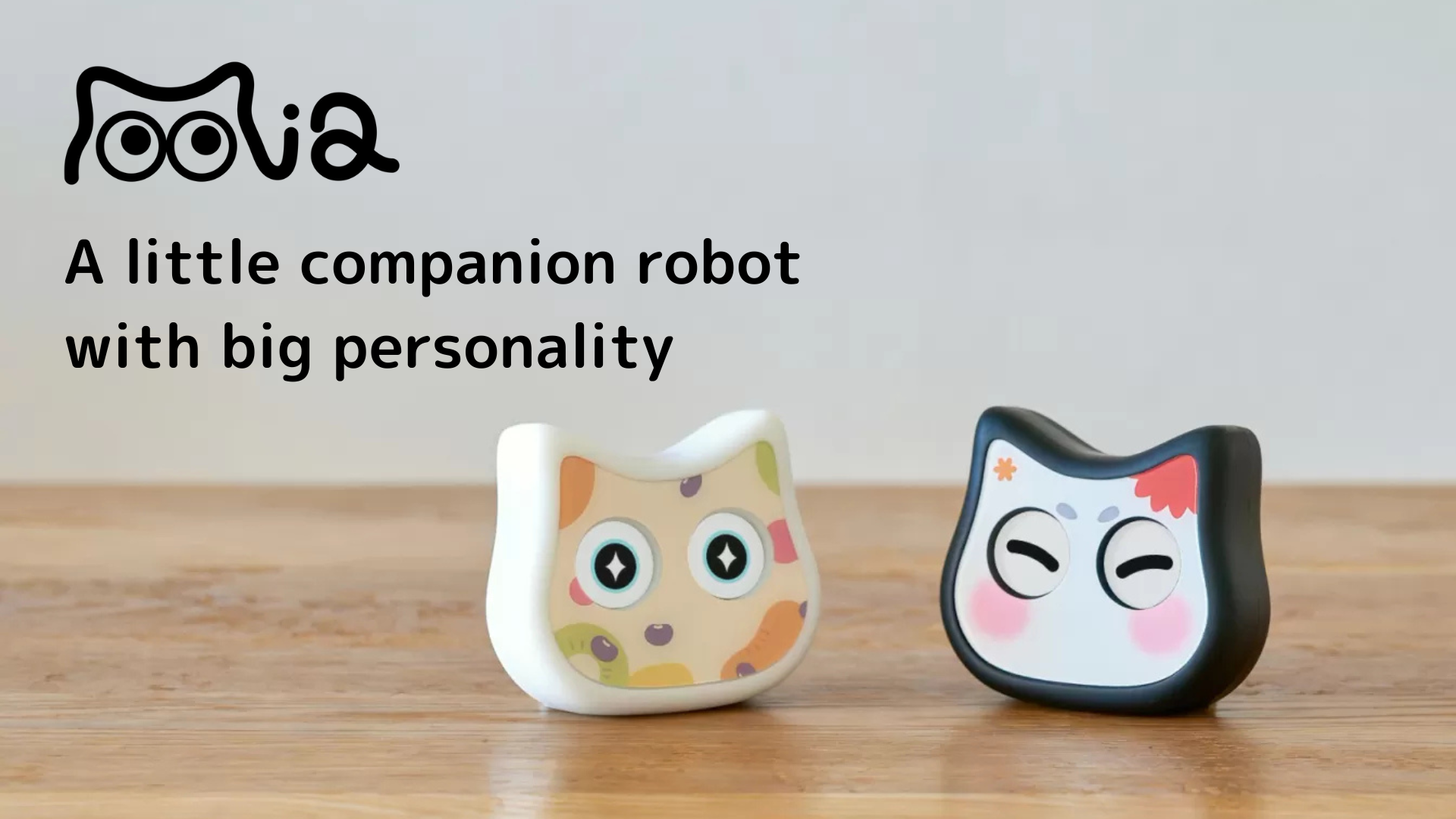
I am developing a talking cat robot “Mia” which speaks various dialects.
In a previous article, ” [Marke] How to create a funnel from product browsing to purchase based on key events in GA4 “, we created a funnel to purchase on Mia’s website.
This time, we would like to work on improving the LP itself, the flow line from the LP to product viewing.
The tool used is Clarity, a heat-mapping tool offered free of charge by Microsoft. The fact that this tool is free is incredibly useful.

Set up heat-map tool Clarity
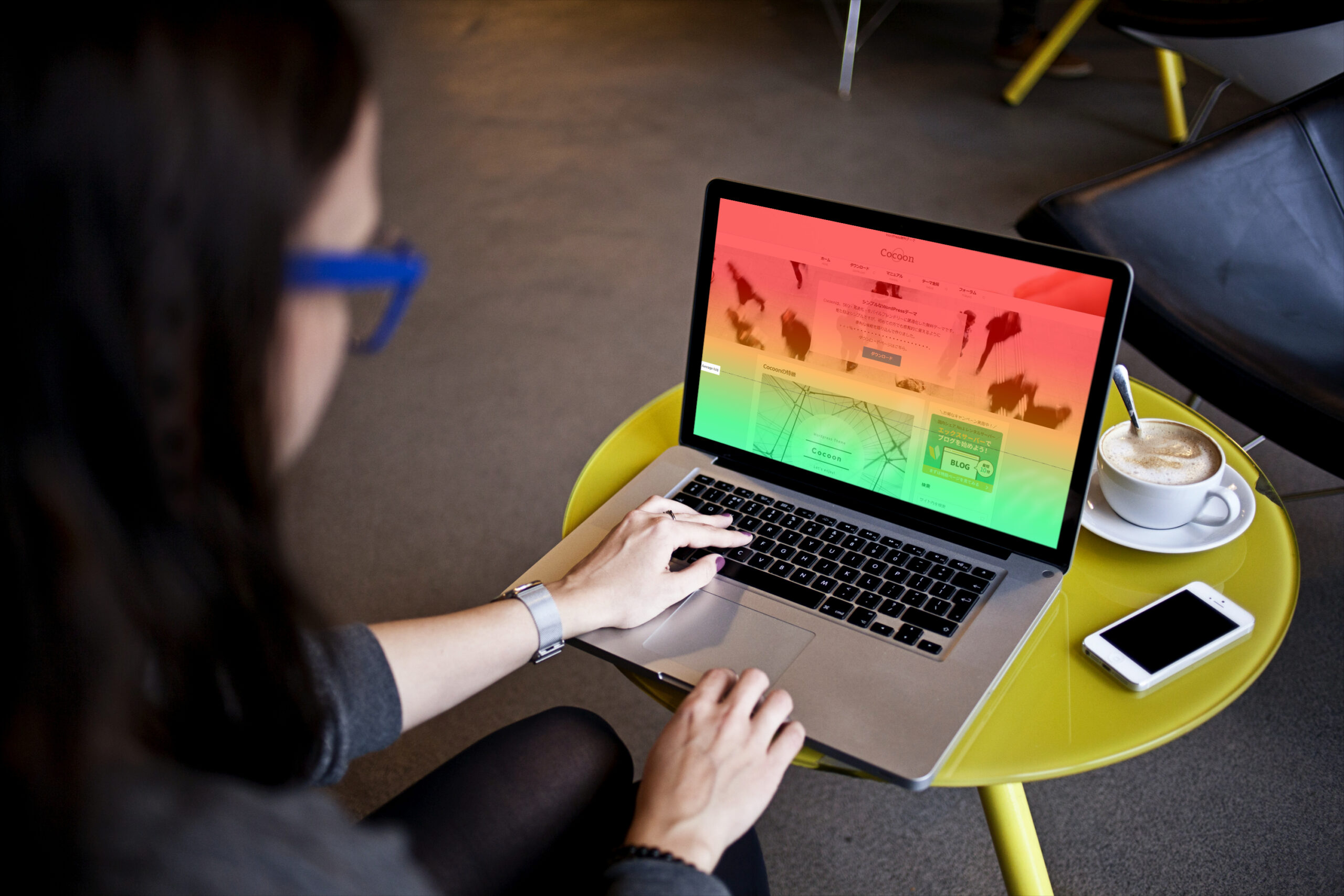
Mia HP uses a WordPress theme called Cocoon.
How to set up Clarity settings for Cocoon is described in this blog post.
Analyze the current situation with the heat-map tool Clarity
I immediately looked at Mia’s Clarity heatmap.
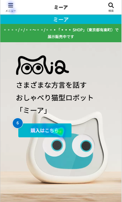
What surprised me a bit was that, surprisingly, the “Click here to buy” button on the first view was pressed in the case of mobile. Basically, we thought that people would scroll down the screen to understand the content further, and although, since most of the time there is an action button that leads to some purchase on the first view, we just followed convention and added it, so we knew that it was actually clicked.
→I thought, “I’m not sure how this is possible,” but then I reconsidered and thought that right-handed users often scroll the screen with their left thumb when viewing a mobile site and that they just happened to hit the “Buy Here” button when they tried to scroll.
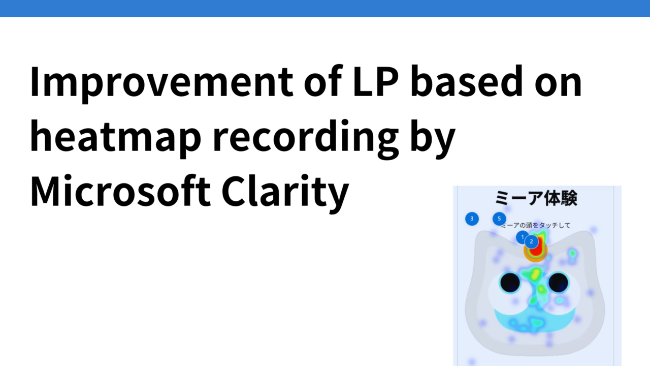
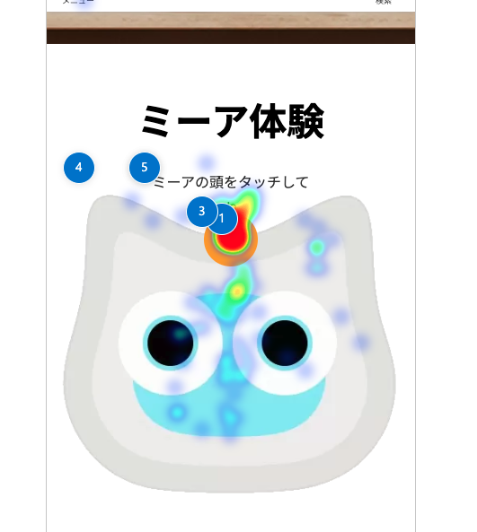
The other thing that surprised me the most was that the button on the head of the Mia experience was regenerating. It turned bright red. More than 20% of the users who visited the LP actually clicked on it to experience the demo.
Some users were pressing the bottom of the orange button and that would not actually play the audio, so we felt it would be better to change the entire Mia body to clickable, even though the head is described as touchable.
The rich menu on the official LINE account says “Mia Demo Experience” in large letters, and clicking on it takes you to the Mia Experience section mentioned earlier, so this may be a factor.
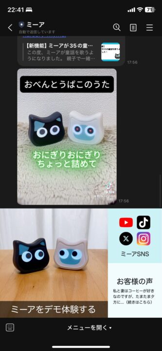
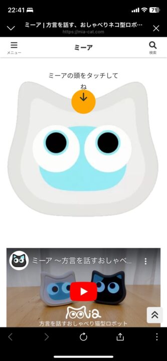
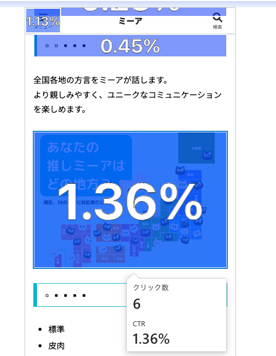
We also found that there are several other areas where users are clicking on images that are not click elements. For example, the following image of a map of Japan. It might be a good idea to transition this to the dialect support announcement page as well.
The heatmap summary function displays AI analysis results
Another feature of Clarity that surprised me was that it did not just put a heatmap on the site, but when the “Heatmap Summary” button was pressed, the results of the heatmap analysis were displayed in the text in the left sidebar.
When I used it about a year ago, this feature would not have been available yet.
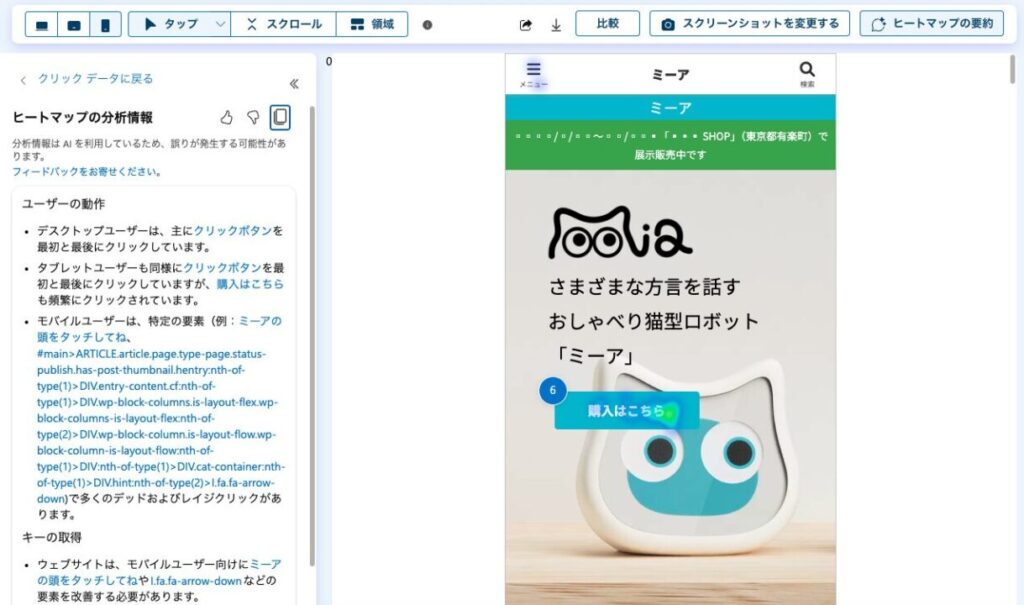
Specifically, the following analysis results were displayed.
User behavior
- Desktop users primarily click the click button first and last.
- Tablet users click the click button first and last as well, but purchases are clicked more frequently here as well.
- Mobile users can use certain elements (e.g., touch Mia’s head, #main>ARTICLE.article.page.type-page.status-publish.has-post-thumbnail.hentry:nth-of-type(1)> DIV.entry-content.cf:nth-of-type(1)>DIV.wp-block-columns.is-layout-flex.wp-block-columns-is-layout-flex:nth-of-type(2)>DIV. wp-block-column.is-layout-flow.wp-block-column-is-layout-flow:nth-of-type(1)>DIV:nth-of-type(1)>DIV.cat-container:nth-of type(1)>DIV.hint:nth-of-type(2)>I.fa.fa-arrow-down ) with many dead and rage clicks.
Key Acquisition
- The website needs to improve elements such as touch Mia’s head andI.fa.fa-arrow-down for mobile users.
- Since the Buy Here button is used frequently on desktops and tablets, it is beneficial to highlight this area.
- On desktops and tablets, the privacy policy link is also of some interest and can improve accessibility to this information.
Recording tools to identify areas for improvement
What makes Clarity even more amazing is that it saves videos of actual users’ movements on the LP. As more and more recordings are accumulated, the videos allow us to see how users actually move
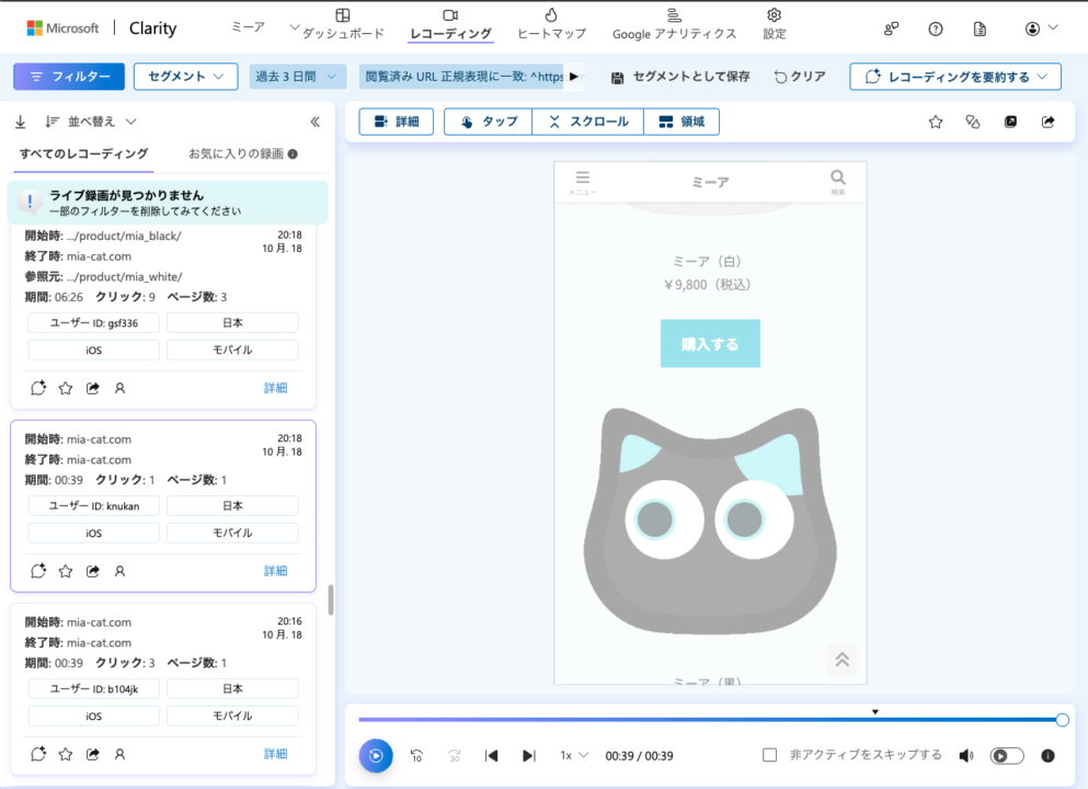
As an aside, I was surprised to see some people browsing the site in Korean. We do not yet support overseas versions of the site but hope to do so in the future.
Incidentally, with regard to recordings, the Recording Summary function also allows AI to display the results of recording analysis in text.
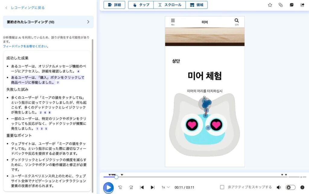
List improvements: eliminate dead links in the Mia experience.
Therefore, we listed areas for improvement based on Clarity’s analysis.
The most important thing is how to make users want to buy into the Mia experience, so we are focusing on improving that area.
Incidentally, Mia’s website was analyzed by Google Analytics, and found that nearly 85% of the traffic came from mobile devices, so we need to design an LP with mobile as the top priority.
LP
- First view: “Click here to buy” button removed
Mia Experience
- Make the entire Mia body Clickable, not just Mia’s head.
- The voice to be played back will also be loaded with added dialects, nursery rhymes, and original messages. When the voice is played back, text will be displayed below the Mia main unit, such as “XX dialect: phrase being spoken”.
Mia Features
- Switch from dialect to facial expression to original message in this order
- Original message function: Remove business-oriented wording and focus only on general users.
Developer’s Thoughts
- It is now three paragraphs, which is a lot, but we will return it to the original one paragraph. Reduce the number of words and make it a link here for details and skip it.
Scroll fixed display motion line added to the footer
- For mobile, a fixed scrolling display motion line is provided in the footer. We initially thought about using the “Buy” button, but we decided to display the “Add LINE Friend” button because it might be too hard to do.
After listing the points for improvement, I reflected on the following points: “As we expand the functionality of our service after its release, we tend to display more information on the LP, because we want to convey the functionality of the service, but especially in the case of mobile view, there is too much information and the user gets lost. How can we keep it simple and not put unnecessary information on the LP?
LP after improvement
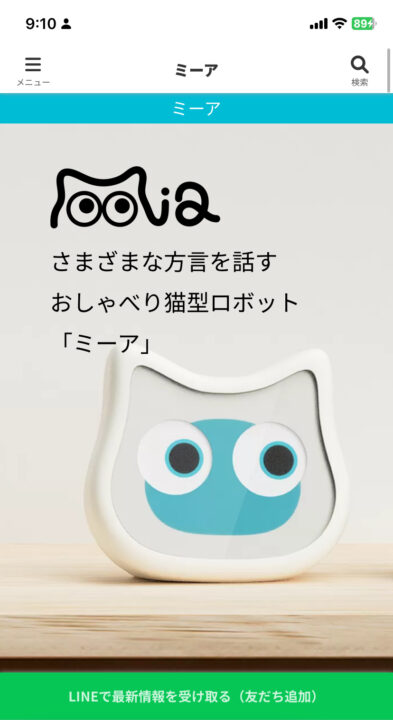
Here is the LP after the improvement.
Removed the “Click here to buy” button from the first view and placed a fixed scrolling “Add LINE Friend” traffic line.
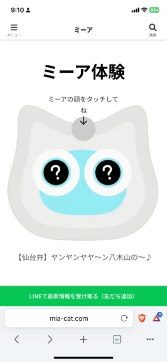
The Mia Experience section eliminates dead links and also displays what the Mia is saying when touched, in text, below the Mia. Newly added dialects and original messages are also played back audibly.
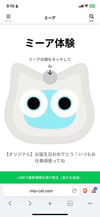
Based on this improvement, we would like to look at Clarity’s heatmaps and recordings again to make improvements.
