Introduction.
I am developing a talking cat robot “Mia” which speaks various dialects.

In this article, we previously described creating a purchase funnel with Google Analytics.
In this issue, we would like to show the total number of units sold so far in chronological order, including the purchase route.
Basically, we sell D2C from our website, but we also sell in-store and wholesale at TiB SHOP and Tsutaya, so I would like to manage those together. So I think I will consolidate them into google spreadsheet this time.
CSV export of WooCommerce order data
As for D2C, WooCommerce is integrated with Stripe to manage sales.
The order data will remain in both Stripe and WooCommerce, but the purchase path is also shown in the “origin” section in WooCommerce, so we will try to export from WooCommerce this time.
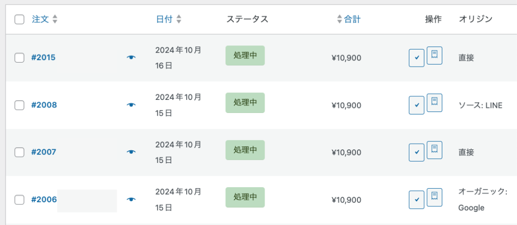
However, the stock WooCommerce plugin does not have an export function, so install and activate the “Advanced Order Export For WooCommerce” plugin, which easily exports WooCommerce order data.

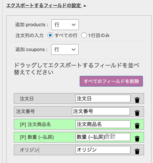
There is a field called “Set fields to export”, so I set it up as follows. We wanted to know the purchase path, so we added the origin.
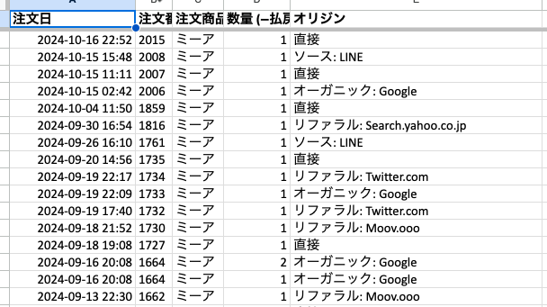
Specify XLSX format to export, then import to Google Drive.
In-store sales exported from the AIR cash register
Export the order data from the Air Registry management screen for the items currently sold in the TiBSHOP store, since credit card payment is being made through Air Registry.
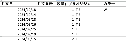
Wholesale sales manually entered order data sent by wholesalers.
Integrate data and graphically display the cumulative number of units sold over time
Automatically merge data from multiple sheets in a Google spreadsheet. Create a new sheet named “Total” and use the QUERY function to combine the data from the four different sheets (D2C, Wholesale, OTC, and Other) created this time into a single sheet.
=QUERY({D2C!A:E; 卸!A:E; 店頭!A:E; その他!A:E}, "SELECT * WHERE Col1 IS NOT NULL", 0)The data from each sheet was included in the “totals” sheet as shown below.
Whenever the data on each sheet changes, the “Integrated Data” sheet is automatically updated as well.
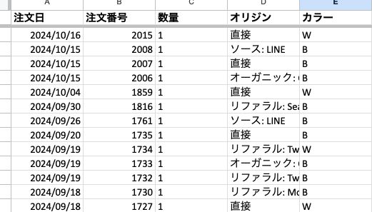
Stacked line graph by date
With the previous QUERY function, the QUERY function is not in ascending date order, so to sort by column A (order date), modify the QUERY function as follows
=QUERY({D2C!A:E; 卸!A:E; 店頭!A:E; その他!A:E}, "SELECT * WHERE Col1 IS NOT NULL ORDER BY Col1 ASC", 0)All sheets are now sorted in ascending order by order date.
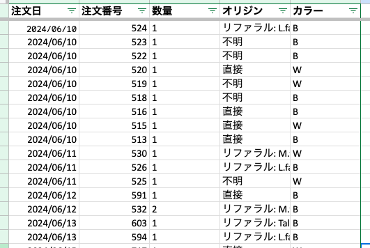
Add a column to calculate the cumulative quantity
This time, we want to graph the cumulative quantity, not the quantity sold on each order date, so we will use column F (Total Units Sold) on the new sheet to calculate the cumulative quantity.
Enter the following formula in cell F2. This calculates the total in column C of the row for which the date in column A is less than or equal to the date in the current row; drag the F2 cell down to apply this formula to the other rows.
=SUMIF($A$2:A2, "<=" & A2, $C$2:C2)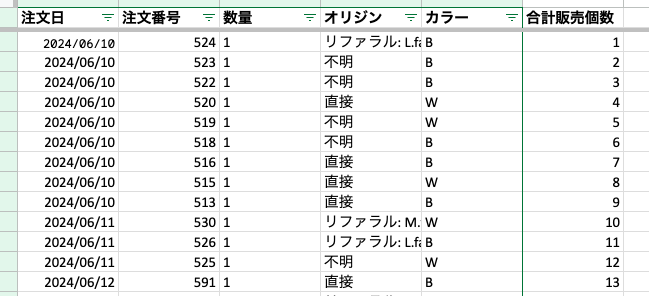
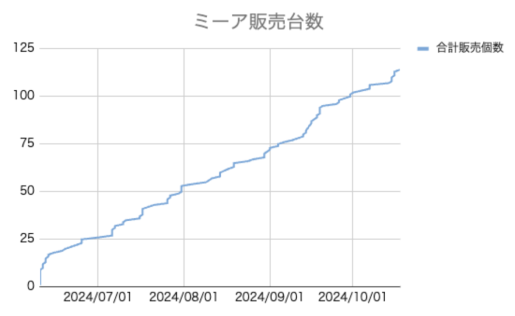
Now that the data is ready, create a graph
- Select “Insert” -> “Graph” from the menu
- Graph type: “Line chart
- Axis settings: Column A (date) on the X-axis, column F (cumulative quantity) on the Y-axis
As of 10/18, the total number of units sold was found to be 114.
We released it on June 10, which means 114 in 4 months, which is roughly one unit per day at present.
Since September, there is a sense that the trend has been somewhat upbeat.
Incidentally, the color ratio was 6 black: 4 white.
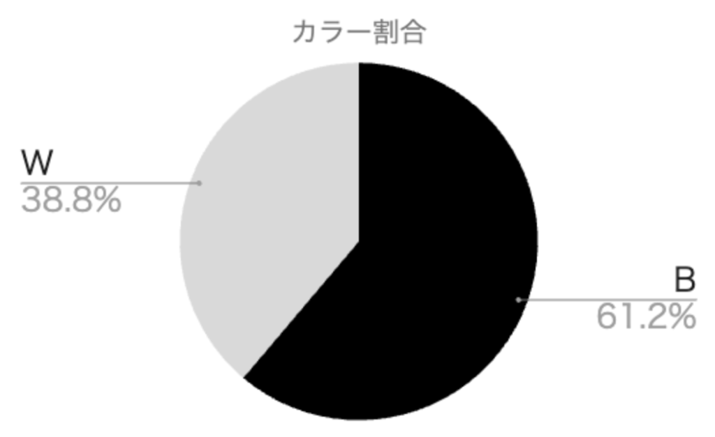
I was not sure which of the two would sell at the time of the initial release, so I held inventory at 50 black and 50 white, but it turned out that it would be better to hold inventory at 6 black and 4 white from now on.
