Introduction
Describes debugging methods and countermeasures when the following RenderFlex overflowed error occurs in Flutter.
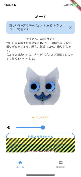
What is a RenderFlex overflowed error?
Simply put, this is an error that occurs when the widget size exceeds the screen range.
The Flutter documentation lists this as one of the most frequently encountered errors.
When this happens, yellow and black stripes appear to indicate overflow areas of the app UI. Additionally, an error message appears in the debug console.
══╡ EXCEPTION CAUGHT BY RENDERING LIBRARY ╞═════════════════════════════════════════════════════════

The overflowing RenderFlex has an orientation of Axis.vertical.
The edge of the RenderFlex that is overflowing has been marked in the rendering with a yellow and
black striped pattern. This is usually caused by the contents being too big for the RenderFlex.
Consider applying a flex factor (e.g. using an Expanded widget) to force the children of the
RenderFlex to fit within the available space instead of being sized to their natural size.
This is considered an error condition because it indicates that there is content that cannot be
seen. If the content is legitimately bigger than the available space, consider clipping it with a
ClipRect widget before putting it in the flex, or using a scrollable container rather than a Flex,
like a ListView.
The specific RenderFlex in question is: RenderFlex#09969 relayoutBoundary=up5 OVERFLOWING:
  needs compositing
  creator: Column ← Padding ← Center ← Listener ← _GestureSemantics ← RawGestureDetector ←
    GestureDetector ← DebugContainer ← HomeTab ← DownloadingOverlayWidget ← DeviceShadowListener ←
    KeyedSubtree-[GlobalKey#1b409] ← ⋯
  parentData: offset=Offset(32.0, 32.0) (can use size)
  constraints: BoxConstraints(0.0<=w<=350.0, 0.0<=h<=740.0)
  size: Size(350.0, 740.0)
  direction: vertical
  mainAxisAlignment: spaceBetween
  mainAxisSize: max
  crossAxisAlignment: center
  verticalDirection: down
◢◤◢◤◢◤◢◤◢◤◢◤◢◤◢◤◢◤◢◤◢◤◢◤◢◤◢◤◢◤◢◤◢◤◢◤◢◤◢◤◢◤◢◤◢◤◢◤◢◤◢◤◢◤◢◤◢◤◢◤◢◤◢◤◢◤◢◤◢◤◢◤◢◤◢◤◢◤◢◤◢◤◢◤◢◤◢◤◢◤◢◤◢◤◢◤◢◤◢◤
Occurs when a child widget in Flex (for example, Columnor Row) grows larger than the space provided by the parent widget. This problem indicates that the widget tree is not managing space properly.
Use Flutter DevTools’ Inspector to identify issues.
When you run the app with Flutter run, two URLs for Dart VM Service and Flutter DevTools will be displayed in the terminal immediately after execution.
Regarding Flutter Inspector (visual analysis and modification of the widget tree), click on the second URL since it is provided by Flutter Devtools, not Dart VM.
Flutter run key commands.
r Hot reload. 🔥🔥🔥
R Hot restart.
h List all available interactive commands.
d Detach (terminate "flutter run" but leave application running).
c Clear the screen
q Quit (terminate the application on the device).

A Dart VM Service on KazutakaのiPhone is available at: http://127.0.0.1:51945/XXXXXXXXXX/
The Flutter DevTools debugger and profiler on KazutakaのiPhone is available at:
http://127.0.0.1:9101?uri=http://127.0.0.1:51945/XXXXXXXXXXX/
When you open “Flutter Inspector”, the second one from the left, you will see an overview of the current widget tree.
ColumnSelect the widget (in this case, the widget) displayed in the error message above by clicking on it.
It’s already displayed as an error message in the terminal, but an error message says that the total of the child widgets in the Column widget protrudes by 1px.
A RenderFlex overflowed by 1.00 pixels on the bottom.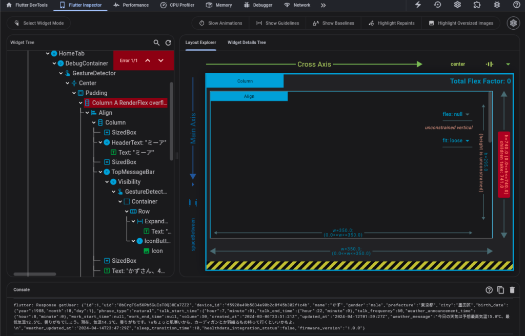
code fix
By the way, here is the code (top screen).
class HomeTab extends ConsumerStatefulWidget {
  const HomeTab({super.key});

  @override
  _HomeTabState createState() => _HomeTabState();
}

class _HomeTabState extends ConsumerState<HomeTab> {
  // ...

  @override
  Widget build(BuildContext context) {
    // 必要なプロバイダーの読み取りやウォッチはここに含める

    return DebugContainer(
      child: Center(
        child: Padding(
          padding: const EdgeInsets.all(32.0),
          child: Column(
            mainAxisAlignment: MainAxisAlignment.spaceBetween,
            children: <Widget>[
              // Overflowエラーを引き起こしている可能性のあるウィジェット
              Align(
                alignment: Alignment.topCenter,
                child: Column(
                  children: [
                    // ... 他のウィジェット

                    // エラーが発生している可能性のあるTopMessageBarウィジェット
                    firmwareUpdate.when(
                      data: (response) {
                        if (response.message == "NEW_FIRMWARE_AVAILABLE") {
                          return TopMessageBar(
                            message:
                                "新しいミーアのバージョン(${response.newFirmwareVersion})がダウンロード可能です",
                            // ... TopMessageBarの他のプロパティ
                          );
                        } else {
                          return SizedBox.shrink();
                        }
                      },
                      // ... ローディングとエラーの状態
                    ),

                    // ... 他のウィジェット
                  ],
                ),
              ),

              // ... 他のColumn内のウィジェット
            ],
          ),
        ),
      ),
    );
  }
}
The cause of this issue is that when implementing the OTA update function below, a new Text widget was inserted at the top of the home screen for firmware update app notifications.
If there is no Firmware update, the notification text will not be displayed as before, so the widget overflow error will not be displayed. However, if there is a notification, the total value of the child widgets will increase accordingly, and the parent widget ( This time it exceeds the width of the Column widget).
In this case, the Column widget is further surrounded by a DebugContainer widget, and 32px padding is specified on the top, bottom, left and right sides.
padding: const EdgeInsets.all(32.0),So, since there is still room for the vertical width of the content, try changing the Bottom from 32px to 0px.
EdgeInsetsis a class used when setting margins and padding in Flutter. fromLTRBis one of the factory methods of that class, and each argument can specify the left ( left), top ( top), right ( right), and bottom ( bottom) margins and padding in pixels. https://api.flutter.dev/flutter/painting/EdgeInsets/EdgeInsets.fromLTRB.html
padding: const EdgeInsets.fromLTRB(32.0, 32.0, 32.0, 0.0),Operation confirmation and future measures
I was able to successfully resolve the overflow error.
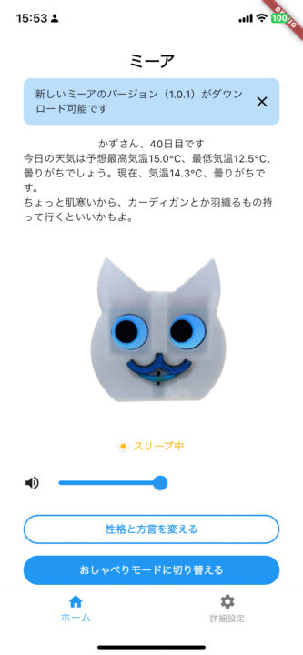
This time, I was able to resolve the error simply by adjusting the bottom, but I need to think about what to do in the future if the amount of content I want to display on the top screen increases.
In this case
- Display a new widget layer on top of other widgets using Snackbar. However, the Snackbar is displayed at the bottom of the screen.
OverlayUse classes to display new widget layers on top of other widgets.ColumnApplying color to a widget’s children so that the widget grows or shrinks to fit the availableExpandedspace .FlexibleSingleChildScrollViewtoColumnwrap the widget and allow the user to scroll through the content to see everything
etc. are possible.
However, in this case, scrolling is not a good option from a UIUX perspective, as there is a lot of content and there is no need to display a timeline by scrolling, like on Twitter or TikTok.
Since the Snackbar is at the bottom of the screen, I think it might be difficult to notice, so I plan to use the Overlay class. I did a little research and found a package called overlay_support that allows you to easily create toasts and in-app notifications.

コメント