Introduction.
Figma’s auto-layout “shortcut: Shift + A” automatically adjusts the distance between elements, allowing for flexible layout management while maintaining design consistency.
However, if the app’s navigation bar design uses a layout that includes icons and titles with a “space between” setting, the titles may be off-center when the icons are hidden.
Layout shifted when icons are hidden
Consider the following, a common application navigation bar.
On the left, if there is a back icon, text in the center, and also an icon on the right.
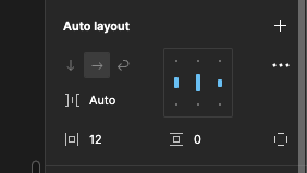
In auto layout, as shown below, the space between elements is adjusted to equalize the width according to the screen width using space between, and the overall margin is 12px on the left and right sides.

In this case, the title is centered if there are icons on the left and right, as shown below.

However, when the left-back icon is hidden, for example, the title shifts slightly to the left. This is because by hiding the icons, the space they physically occupy is also removed. If only the right icon is hidden, the title will be slightly shifted to the right as well.

I think it happens frequently that navigation components are created with left and right icons and then copied and applied on each screen. In that case, if the right icon share is not necessary for this screen, etc., the title will be slightly shifted to the right if it is hidden, which is a problem, which is troubling.
Solution: set icon opacity to 0%.
One solution is to set the opacity of the icon you wish to hide to 0%. In this way, the icon disappears visually but physically occupies space so that the title remains centered.
The opacity setting is the pass-through portion of the layer in the right sidebar. Normally it is set to 100%, so change the number here.

If you change it to 0% as shown below, you can see that it visually disappears, but physically occupies space.

The “pass-through” mode is Figma’s default mode, a blend mode in which the colors and textures of the upper layers affect the lower layers. If the opacity is set to 0%, the influence of the upper layer is completely eliminated and the existence of the upper layer is ignored. As a result, visually it is as if the upper layers do not exist, and only the lower layers are visible.
Opacity shortcut icon: 00
Figma has a shortcut icon for opacity.
While selecting an object, you can adjust the opacity by clicking on the numbers below.
While selecting an object, pressing “1” will set the opacity of that object to 10%, and pressing “8” will set the opacity of the object to 80%. It also works with two digits, so pressing “65” will set the opacity to 65%.
Note that 0 means 100% (no transparency) and 00 means 0% opacity (100% transparent and visually invisible).
| Shortcut key (numeric) | opacity |
|---|---|
| 0 | 100%. |
| 8 | 80%. |
| 65 | 65% of |
| 1 | 10% (%) |
| 00 | 0 |
When it is useful to hide icons
Even for the same navigation bar, there may be cases where a layout that hides the icons and takes up less physical space is necessary.
For example, if you have the search bar centered as shown below. There is a user icon on the left side, but on screens without a user icon, you may want to display the search bar all the way to the left. In such cases, simply hide the icon as before.


Summary
If you want to hide the icons, and you want to keep the layout intact, we found that you can do so by entering the shortcut “00” with the icons selected and setting the opacity to 0%.
By creating only one Component as generic as possible, duplicating it for use on the screen, and making full use of icons to show and hide, opacity, etc., changes can be centralized in Components to manage mockups with ease.


コメント