Introduction.
When cross-platform (web and app) development is being conducted, icon guidelines have not been established due to historical background and resource prioritization, and separate icons may be used even though they are the same service.
In doing so, it describes how icon guidelines should be created and unified.
Which icon to create based on: FontAwesome vs Material Icons
Font Awesome and Material Fonts are well-known icon fonts. Each has the following characteristics.
- The free Web icon font allows the use of about 2,000 icons, and the paid version allows the use of about 20,000 icons.
- Cute rounded design
- It is the latest icon font officially offered by Google, integrating more than 2,500 different icons into a single font file.
- Geometric Design
- Use of Variable Icon Fonts: Including Material Symbols provided by Google allows for easier adjustment of icon size, thickness, and slant, resulting in more dynamic designs
For example, regarding the “Like” button, the left one is Material Icon and the right one is Font Awesome; the left one is more geometric and the right one is more rounded and pretty.
My personal preference is on the right side, but Font Awesome has exquisite timing, and the icon I want to use is in PRO and I have to sign up for a paid contract.

What are the criteria for making an original icon?
There are two main motivations for creating original icons
1) There is no appropriate icon in the icon library.
(2) You want to emphasize the functionality of the service by using your own icons.
Personally, I think it is better to “basically use icons from the icon library and not create your own icons unless you have a lot of experience.
As for unique icons, it is necessary to spread the icons among users along with branding, which requires considerable effort, and even if it is possible, it is risky because most of the icons are not as recognizable at a glance or as easy to operate as common icons.
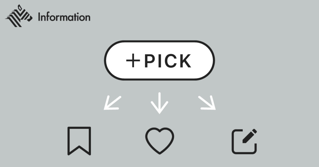
For example, NewsPicks, whose main function is to pick news, used its own icon for a long time but eventually switched to a generic icon. I think the PICK icon was just a button with the word “PICK” on it, so the question “What is a PICK?
NewsPicks’ “PICK button” is one of the features that has remained unchanged since the launch of the service.
Source: the role of the PICK function will change (1/22/2024)
Actions such as commenting on news, sharing surprises and discoveries, and saving as a personal reminder are all integrated into a single button.
However, as the number of users has increased and the times have changed, more and more users have said that they find it difficult to understand the meaning of the PICK button.
On the other hand, I personally think that Note’s “add article” icon is a unique icon, but is well appealing.
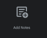
While indicating that it is an “article,” a Note service, with a spread note icon, the “+” button in the lower right corner makes it easy to recall that the action is to “add an article.

Incidentally, there was no perfect match in FontAwesome for the icon for adding articles and notes, and the following icon was a hit in Google Fonts.
Nevertheless, when the need to create an original icon inevitably arises, here is a reference as a guideline on how to create one.
SmartHR Design System: Icon Creation Guidelines
https://smarthr.design/basics/icons/creation-guideline/
LINE: Icon Creation Guidelines
https://designsystem.line.me/LDSM/foundation/iconography/iconography-ex-en/
Decide on a policy that also takes into account development costs.
Chakra UI/react-icons features
This is an individual event from here, but at Antaa, the physician platform service I am currently involved with, Chakra UI is used to select icons for Antaa Slide, a slide-sharing service for physicians and medical students.
On the other hand, the application is developed in React-Native and uses react-icons.
Development costs must also be considered when determining design guidelines.
First, regarding Chakra UI, it seems possible to centralize to react-icons since react-icons can be imported as an external icon library.
// 1. Import
import { Icon } from '@chakra-ui/react'
import { MdSettings } from 'react-icons/md'

// 2. Use the `as` prop
function Example() {
  return
}
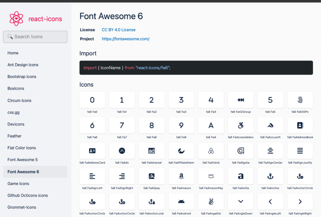
React-icons offers icons from several icon libraries, including FontAwesome, Material Icons, and Ionicons. The left sidebar lists a number of icon libraries that are imported.
The approach determined based on the above
- Using React-icons, select icons in the order Material Icons > Font Awesome > Other.
For example, if you want to create a bookmark icon as a component of Figma, first search for “md bookmark” (md stands for material design) in react-icons and see if there is a bookmark icon in Material Icons. If there is, use it. If there is, use it.
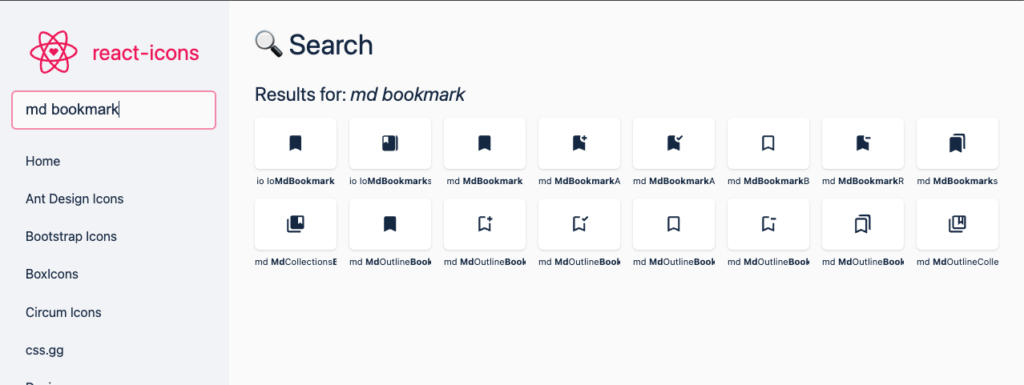
If you want to display a lung icon in a respiratory-related content display, search for “md lung” and if it is not in the Material Icons, use it from elsewhere.

Also, when creating icon components in Figma, the file name of the icon should be Code for react-icons. Since engineers only need to know the code of react-icons.
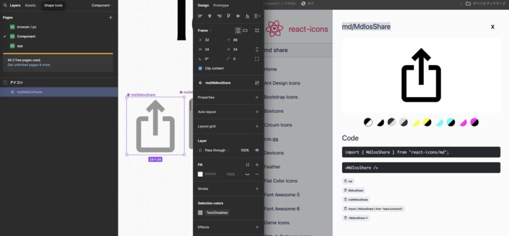
Here is the actual Figma icon component created.
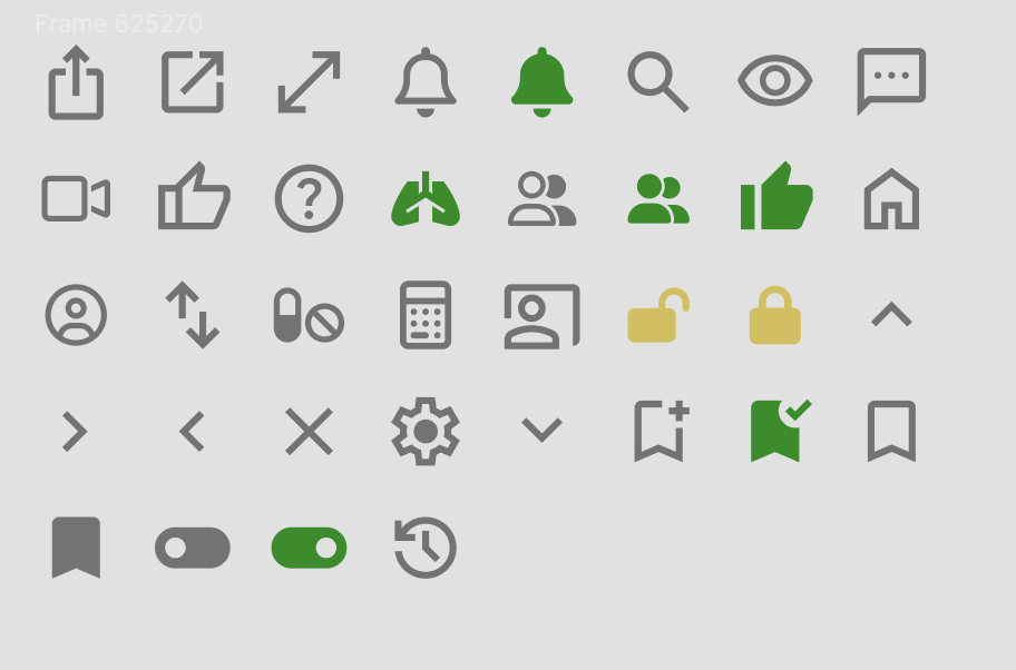
Suppose, when creating a bottom bar component, you want to call the icon.
Since the code name of react-icons has a hierarchical structure like “md/MdOutlineAccountCircle” and figma understands the hierarchical structure of component names, all icons of material design are stored under md as shown in the figure below and It is also convenient in this respect.

Click here to see how to use Figma’s auto-layout to prevent misalignment when hiding icons.


コメント